How to Build a restaurant logo to be proud of
Build a Restaurant Logo Anyone Would Be Proud Of
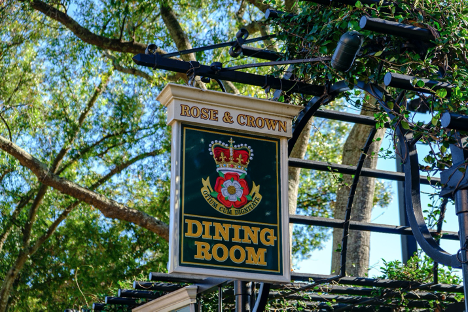
Unsplash.com
The restaurant business is intensely competitive — and even “intensely competitive” is probably understating it. With some 661,000 restaurants in operation in the United States alone and over 13,000 new restaurants starting up each year, a new place needs all the edge it can get.
And an excellent restaurant logo definitely counts as “edge.”
Whether you’re creating a restaurant logo for your own newly launched eating place, or designing a logo for an aspiring restaurateur, here are five keys to building a restaurant brand that anyone would be proud to display — and any foodie would be happy to try out.
Send a Message
Logos, and branding in general, should be designed to send an appropriate message to the viewer. This is especially important for a restaurant logo, because the message you want to send is, “Hey, eat here!”
Messaging is often tied up in the graphics that are used for logos. For restaurant logo designs it is important to note that specifically, the structure is often based around the type of food that is offered. For example, a Japanese or sushi restaurant may use sushi for their image; a seafood restaurant may use shrimp, fish, or crab; Italian restaurants may use pasta or basil leaves, and so on.
That’s the clearest way to communicate to your viewer what type of restaurant it is. If that’s a little too on-the-nose for your design aesthetic, however, there are other icons and imagery that also send an “Eat here!” message.
Forks, spoons, knives, and other silverware
Chefs or chef hats
Covered dishes
Leaves or greenery
However, it should be noted that these are commonly used icons; so, before you settle on one, make sure that it is a unique take on a classic look, and also ensure that your choice isn’t too close to any competitor’s existing logo.
There are other aspects to your logo that will contribute to the overall “Give us a try!” messaging, too.
Choose Colors to Stimulate the Appetite
Did you know that certain colors will whet your appetite and make you more likely to go and get something to eat?
The psychology of color indicates that just as blue is soothing, red is stimulating — and it can even stimulate the appetite. Research shows that red is the most commonly used — and most effective — color in restaurant design. Just like a photo of a dish can persuade a diner to give it a try, your color choice can influence newcomers to give your restaurant a shot. As writer Jackie Lohrey puts it, “We eat with our eyes. This makes color critical in most every aspect of successful restaurant designs.”
Of course, you don’t just want to use red exclusively in the hopes that it will make your viewers super hungry. Red is a strong color, and it’s best used in restrained measures, such as for your restaurant sign. Natural colors that are actually found in the food you serve at your restaurant make excellent colors for your palette; for instance, if you feature salads and vegetarian options, shades of green could be a great color palette.
Most importantly, make sure that your colors play well together. And try to limit the logo palette to two or, at most, three.
Use a Dynamic Font
There’s a psychology to font choice, too, but font choice is somewhat in the eye of the beholder. One thing that’s for sure with a restaurant logo, however, is that you want it to be dynamic.
Opt for a heavier weight font, something that carries the logo. Make sure that it is clearly legible and easy to read. Match your font to your logo graphic style; if you use thick lines in your graphic, use thick lines in your font.
The common advice for font choice when it comes to logos is to avoid anything that’s too frilly or complicated. Your logo isn’t going to be very big, so legibility should be prized over a cool, unique, complex font.
Keep It Simple
Along the same lines, try to keep your logo overall as simple as possible. Don’t throw in too many bells and whistles; the logo is there to direct your potential customers to the restaurant itself, not to distract them with multi-layered visuals.
Keeping logo design simple — keeping pretty much any type of design simple, as a matter of fact — is common advice from graphic designers. It has been repeatedly shown to be the most effective style, especially for logos.
Make It Adaptable
As a final key to creating a fantastic restaurant logo, remember that it needs to be adaptable. The logo will be printed on a variety of surfaces, used in a variety of areas — it will show up on the side of the building, in advertising and marketing, on business cards, on the website, printed on the menus, etc.
Ensuring that it is a vector image is a good place to start. That will keep it from losing integrity when you have to resize it for different purposes.
Make sure that it also shows up well in black and white or with a strictly limited color palette. If possible, double check to make sure that it will show well against different colors and patterns — for instance, you might want to include a border and white space to allow the logo to stand on its own, no matter what background it is printed on.
Restaurant logos have a big job — they’re the front line workers in an arena with massive competition. Creating an excellent restaurant logo isn’t a “one size fits all” solution — let the style of restaurant inform the style of the logo design in order to ensure accurate messaging. An awesome restaurant logo is the first sign that the restaurant itself is definitely worth checking out.
Write Profile
Working as a freelance content writer is not only Chloe Philips’ profession but her hobby too. She loves to write about fashion design, interior décor and blogging. Connect with her to find out how she can help you in your content development strategy.
also see The 50 Best Fonts for Logos in 2020 from DW design wizard.